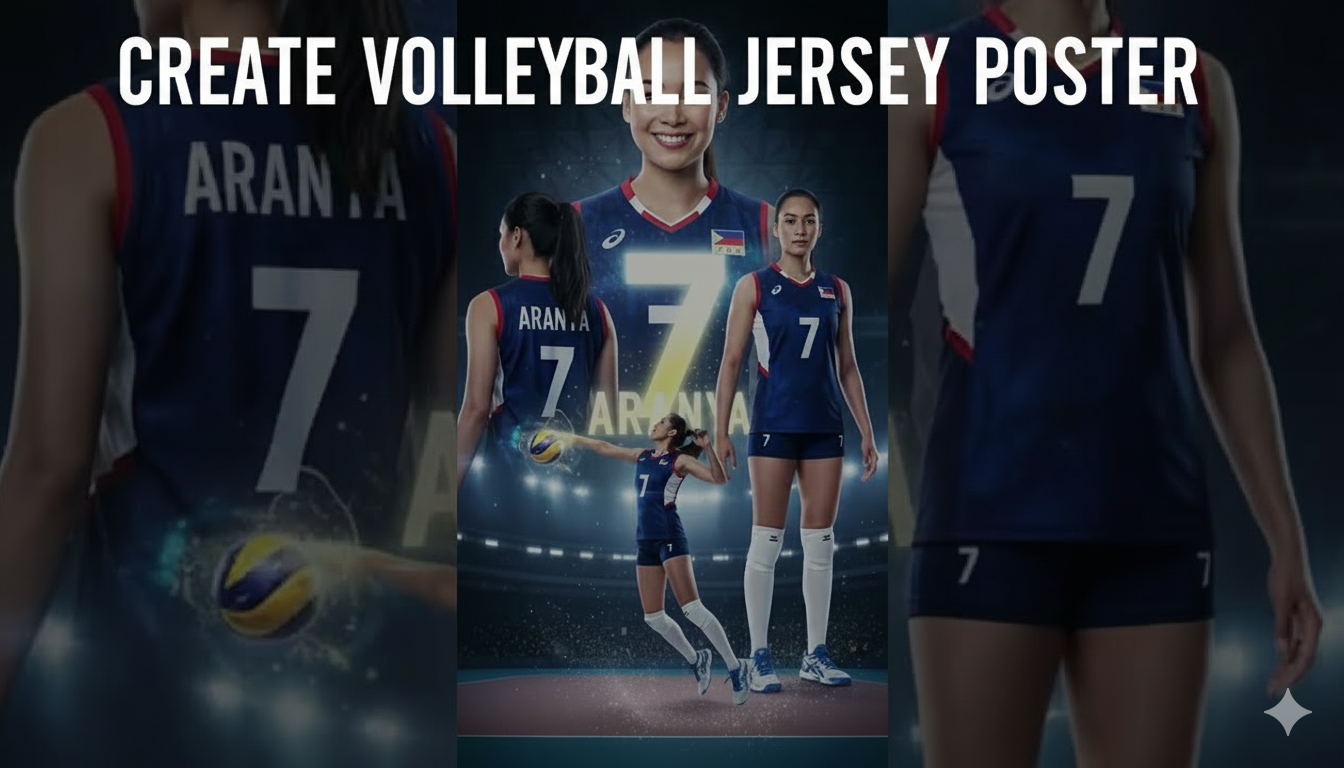
Creating a standout volleyball-jersey poster using artificial intelligence (AI) blends design thinking, brand identity, technical execution and distribution strategy. Whether you’re designing for your club team, an upcoming match, a product launch or simply for fun, this guide walks you through everything—from concept to delivery.
Here’s what we’ll cover:
-
Why create an AI volleyball jersey poster
-
Key design considerations (colours, typography, layout, imagery)
-
Choosing your tools and workflow (AI generators, editors, layout software)
-
Sourcing & preparing assets (jersey image, team badge, sponsor logos)
-
Generating jersey visuals with AI
-
Designing the poster layout
-
Adding finishing touches (effects, text, print/digital versions)
-
Exporting, printing & distribution
-
Legal & ethical considerations
-
Best-practice checklist & wrap-up
1. Why Create an AI Volleyball Jersey Poster
A poster centred on your volleyball jersey can serve multiple purposes: brand building, fan engagement, product promotion, event announcement, team identity reinforcement, and more. Using AI in the workflow adds speed, flexibility and creative possibilities.
Here are a few reasons:
-
Visual impact: A big, bold jersey image draws attention. A well-designed poster can become part of your visual identity.
-
Storytelling: The kit represents the team—colours, badge, number, name, design cues. The poster becomes a narrative piece.
-
Versatility: Use the poster for social media, print, set-pieces in clubhouses, merchandise launches.
-
Efficiency & creativity via AI: AI tools enable rapid iteration of colourways, patterns, backgrounds, mock-ups without needing advanced design skills. For example, guidance on football jersey posters with AI discusses colours, contrast, typography and workflow. Puletech
-
Brand consistency: When done correctly, the poster reinforces your team’s brand (colours, typography, imagery) and gives your material a unified look.
-
Fan/fundraising tool: Posters can become limited edition items, used to raise funds or build fan loyalty.
In short: if you take time to do it right, an AI volleyball jersey poster can elevate your team’s visual identity, engage your audience and deliver real value.
2. Key Design Considerations
Start by defining your visual foundations. Before touching tools and workflows, you’ll want clarity on these core elements:
Colours & Contrast
-
Choose your primary team colours (home kit) and possibly secondary/away colours.
-
Ensure high contrast between key elements (jersey number/name, background) so things read well even at a distance. For instance: dark base with light number, or bright accent on dark field.
-
Avoid overly complex gradients or colour transitions if print quality might suffer. As one article on football jersey posters points out: “Choose the team’s primary and secondary colours… Ensure good contrast.” Puletech
-
If you plan to print the poster, remember CMYK vs RGB issues—some vibrant screen colours may not print as expected.
Typography & Numbering
-
On a jersey and in the poster, the player number or team name often needs to be clearly legible. Use block or athletic fonts that read well from a distance. One custom-jersey design guide emphasises: “Your team name and player numbers should be easy to read from a distance… avoid cursive or overly decorative fonts.” The Jersey Lab
-
Poster text (headline, tagline) should also follow clear hierarchy: big bold headline, smaller sub-heading, even smaller body text.
-
Consistency matters: if your jersey uses a specific typeface for numbers, consider carrying that into poster typography for cohesion.
Layout & Composition
-
Decide on poster orientation: portrait (common for posters) or landscape (for banners).
-
Visual hierarchy: the jersey should be the star—big, central, dominant. Supporting text, logos, background elements should complement not compete.
-
Use negative space effectively so the design doesn’t feel cluttered. A sports-poster design article advises leaving ample white (or negative) space so elements breathe. Medium
-
Background should not overwhelm the jersey—either contrast it or keep it subtle.
Imagery & Style
-
Decide whether you’ll go photorealistic (a real jersey or model wearing it) or stylised/illustrative (vector kit, AI-generated mock-up).
-
Consider textures: fabric weave, mesh, lighting (stadium lights, spot-light), shadows. These add realism and depth.
-
Visual style should match your team’s vibe: classic, modern, high-tech, retro.
-
If you include a background image (stadium crowd, net, volleyball motion blur), ensure the jersey remains legible and the design remains focussed.
Print vs Digital Considerations
-
For print: aim for high resolution (300 dpi or more), use CMYK colour profile. Leave bleed and safe margins.
-
For digital/web: RGB profile, file size optimisation, consider various formats (square for Instagram, portrait for stories, etc).
-
Make sure your poster works at multiple scales: big print on a wall, small thumbnail on social media.
3. Choosing Your Tools & Workflow
With your design fundamentals defined, next decide on your tools and workflow. Here’s a breakdown:
AI Generation Tools
-
Use a text-to-image AI generator (e.g., Midjourney, DALL·E, Stable Diffusion) to create jersey visuals from a prompt.
-
Use specialised templates for jersey or sports apparel (for example, platforms like Pippit offer jersey layout templates and sports jersey graphic templates. Pippit+1
-
Key: Craft good prompts that specify items such as fabric texture, lighting, angle, colour scheme, number/name, badge placement.
Graphic/Design Software
-
Use Adobe Illustrator or Photoshop (or free alternatives like GIMP/Inkscape) to refine visuals, lay out the poster.
-
For layout: tools like Canva, Affinity Designer, or other poster design tools can suffice if you keep it simple. A sports poster design article mentions using template-based design with focus on readability and hierarchy. Medium
-
Use vector assets for logos, badge, sponsor icons so scaling isn’t a problem.
Workflow Overview
-
Concept & mood-board (colours, fonts, style, reference images)
-
Generate jersey visuals with AI
-
Refine the jersey image (isolate it, clean up artefacts, ensure clarity)
-
Create poster layout (document size, orientation, grid lines)
-
Insert assets (jersey, badge, logos, background images)
-
Add text, typography, effects
-
Check legibility at different sizes, colour correctness, print proofs
-
Export final output for print and digital
-
Distribution/promotion
4. Sourcing & Preparing Assets
A strong poster needs good assets. Here’s what you’ll generally need and how to prepare them:
Team Badge / Crest
-
If you’re using a team badge, secure a high-resolution version (ideally vector – SVG or AI) so it scales crisply.
-
If it’s a custom team or fictional team, you might design the badge yourself (or use AI to generate a concept and refine).
-
Keep clear space around the badge so it doesn’t appear cramped.
Sponsor Logos (if any)
-
Ensure you have rights/permission to use any third-party sponsor logos.
-
Get transparent PNGs or vector files to overlay cleanly.
-
Resize appropriately—too large and they dominate, too small and invisible.
Jersey Image / Mock-up
-
You might have a real photograph of the jersey (flat lay or worn by player) or you generate one via AI.
-
Ensure the image is high resolution and well lit. Remove background if necessary for clean overlay.
-
If using a mock-up: ensure correct perspective, lighting, shadows.
-
For AI-generated: check for artefacts around numbering/names, badge misalignment etc and clean these up manually.
Fonts & Typography
-
Select athletic / sports-style fonts for numbers and names. For poster text, choose fonts that match your brand identity.
-
Ensure licensing allows use (especially if this is commercial).
-
Prepare font hierarchy: heading, sub-heading, body text.
Background & Supporting Visuals
-
A background might include textures (fabric, mesh), environment (net, court, stadium), abstract shapes (motion lines, energetic diagonals).
-
Use high resolution images or vector backgrounds so scaling remains crisp, especially for print.
-
Make sure the background does not overshadow the jersey—subtle is often better.
Setting up the Working File
-
Choose your output size: e.g., A2 (420×594 mm) at 300 dpi for print. For digital: e.g., 1080×1920 px for story, 1080×1080 px for feed.
-
Set colour profile: CMYK for print, RGB for web.
-
Include bleed (commonly 3–5 mm) and safe margin (10-15 mm inside edge) for print.
-
Use layers: jersey, badge, text on separate layers—so future edits are easier.
5. Generating Jersey Visuals with AI
This is where the fun begins—creating or modifying the jersey visual element that will anchor your poster.
Step 1: Define Your Concept
-
Ask yourself: what style is the kit? Classic/clean? Modern/tech? Retro/vintage?
-
Example prompt (for a volleyball jersey)
-
Be clear about fabric, lighting, perspective (flat-lay vs worn by athlete), background scenario.
Step 2: Generate or Edit
-
Use a tool like Midjourney or equivalent. Input your prompt.
-
Generate several variants. Choose the best one(s).
-
If you already have a jersey image but want to alter colours or pattern, use an AI image-editor or overlay technique.
Step 3: Refine & Extract the Jersey Element
-
Once you have a satisfying jersey image, if needed isolate it (remove background) and clean edges.
-
Check the number and name on the back are clear and crisp; sometimes AI causes blurriness.
-
Align logos and badge properly; if mis-positioned, tweak manually in Photoshop/Illustrator.
-
Save the jersey image as a transparent-background PNG or layered file for flexible use.
Step 4: Create Variants if Needed
-
If you want alternate colourways (home/away kit) or alternate mock-up views (front/back, worn/flat) generate them.
-
Keep consistent placements of number, badge, logos to maintain brand cohesion.
Tips & Warnings
-
When specifying prompts, mention: “realistic woven fabric texture”, “side panel contrast”, “volleyball theme” etc.
-
Pay special attention to legibility of the number and name on the jersey—they must remain readable when placed on poster.
-
If you plan to print: ensure the generated image resolution supports the required print size—think in terms of pixel count at 300 dpi.
-
Colours on screen may look different when printed (due to CMYK conversion). Do test prints if possible.
-
Keep an editable version of your file (layers intact) so you can change name/number later without re-generating everything.
6. Designing the Poster Layout
With your key visual (jersey) ready, you now assemble the full poster.
Step 1: Choose Size & Orientation
-
Decide output size: e.g., A2 for print, or custom dimension for social media (1080×1920 px for a story).
-
Orientation: portrait is most common for posters. Landscape can work for banners or digital headers.
Step 2: Set Up Grid & Layout Structure
-
Use guides/rulers to define margins, safe zone, bleed.
-
Divide the poster logically: maybe top header area (team name/headline), central visual area (jersey), bottom area (event date/tagline/sponsors).
-
Consider an asymmetrical layout for dynamic impact: jersey slightly off-centre, background elements overlapping edges, etc.
Step 3: Insert the Jersey Mock-up
-
Place your jersey image prominently. It might fill large central area or be angled for dynamic effect.
-
Consider scaling so it’s big enough to dominate but still has room for supporting text.
-
Add a subtle drop shadow or glow so the jersey stands out from the background.
Step 4: Add Background & Visual Effects
-
Use a background image or texture that complements the jersey. For example: a stadium crowd blur, subtle fabric mesh texture, or abstract diagonal motion lines to suggest movement.
-
Consider lighting effects: spotlight behind jersey, gradient overlay, motion blur, subtle vignette. These draw focus.
-
Use consistent colouring: if your jersey uses electric blue and neon yellow trim, you might incorporate those accent colours into the background elements (glow, lines, text highlights).
Step 5: Insert Text – Headline, Tagline, Team Info
-
Headline: e.g., “NEW KIT LAUNCH 2025”, “UNLEASH THE SPIRIT”, “HOME OF THE CHAMPIONS”. Use a big bold font.
-
Sub-heading: date, season, campaign slogan, or match info.
-
Body/foot text: team name, sponsor credits, web/social links, call-to-action (“Shop now”, “Join the team”, “Support us”).
-
Placement: ensure text doesn’t obscure the jersey. Leave clear space around important visuals.
-
Use typographic hierarchy: large heading → medium subheading → small body text.
Step 6: Insert Logos & Sponsorships
-
Add the team badge crest, sponsor logos, league logos (if applicable) at appropriate locations.
-
Make sure logos are high resolution/vector; maintain aspect ratio and clarity.
-
Placement tips: Badge often front/chest area (on jersey). On poster: maybe top-left or near jersey. Sponsors/logos often at bottom or side margins.
Step 7: Colour Consistency & Branding
-
Use your team’s brand colours consistently across poster: jersey colours, text accent colours, background elements.
-
If your jersey has trim colour (e.g., neon yellow), use that as an accent in text or graphic lines. This creates cohesion.
-
Avoid introducing too many new colours—stick to 2-3 primary colours + 1 accent.
Step 8: Balance, Whitespace & Legibility
-
Make sure there’s enough whitespace/negative space so the design doesn’t feel cluttered. As mentioned earlier: sports posters benefit when elements breathe. Medium+1
-
Test how the poster looks when viewed from a distance (simulate small thumbnail and large print scale). Ensure key elements (jersey, headline) still read clearly.
-
Check legibility on different device sizes (if digital) and under different lighting (if print/display).
7. Adding Finishing Touches
With layout in place, it’s time to polish and prepare for output.
Colour Adjustments & Calibration
-
For print: convert your design to CMYK profile and preview colour shifts. Some vibrant RGB colours may lose saturation or shift hue.
-
Make minor tweaks to saturation and contrast so print result matches your vision.
-
For digital/web: ensure you use sRGB profile and preview on multiple devices (desktop, mobile) to check consistency.
Typography & Legibility Check
-
Zoom out/thumbnail view: does the headline still stand out? Is the number/name on the jersey still clear?
-
Check font sizes and spacing (kerning/tracking) especially for display text.
-
Ensure no text is too close to edge or bleed-zone; keep safe margins.
Effects & Textures
-
Add subtle drop shadows, embossing, or textures where appropriate to enhance depth (e.g., light fabric texture overlay, subtle gradient on background).
-
Use overlays like a slight film grain or vignette to unify elements and give a more professional print feel.
-
But avoid over-doing effects—too many effects can distract from the hero (the jersey).
Print-Ready Check
-
Ensure resolution is appropriate: for print, 300 dpi (or higher) recommended for large format.
-
Convert text to outlines (or embed fonts) if required by printer.
-
Include bleed (typically +3-5 mm) and crop marks if sending to professional printer.
-
Flatten layers if necessary or ask printer whether layers are allowed.
-
Test the file by printing a smaller size version to check colours, resolution, clarity.
Digital Export Check
-
Create versions optimized for digital: e.g., JPEG for web with high quality (~80-90%), PNG if transparency needed.
-
For social media: export square (1080×1080 px), portrait (1080×1920 px) for stories, and ensure file size is optimized (fast loading).
-
Use descriptive file names and alt-text (for web accessibility/SEO): e.g., “Team-X-volleyball-home-kit-poster-2025.jpg”.
-
Consider multiple aspect ratios so you can reuse the design across platforms.
Final Proofing
-
Print a proof (if possible) or view on different monitors to check for colour accuracy, clarity, alignment.
-
Get feedback: a second pair of eyes catching alignment issues, spelling or logo placement can save time.
-
Double-check all spelling, dates, numbers, names. One typo can ruin a launch.
-
Ensure you have the rights to all assets (logos, fonts, images) and permissions if required.
8. Exporting, Printing & Distribution
Now that your design is final, it’s time to bring it into the world.
Exporting for Print
-
File format: often PDF/X-4, or TIFF with layers flattened, depending on your print shop’s specs.
-
Include crop marks and bleed.
-
Choose paper stock: glossy, matte, satin—each gives different feel. Gloss gives more punch; matte may feel more premium.
-
Choose size: A2, A1, banner, depending on placement.
-
Send a proof or sample print if budget allows.
-
Communicate with your print provider: ask their recommended colour profile, bleed, resolution, margin specs.
Distribution & Placement
-
If the poster is for your team clubhouse, stadium foyer, retail store, or online shop: ensure placement is visible, well-lit, and protected (if outdoors, laminated or weather-resistant material).
-
For street/poster board placements: weather-resistant material, proper mounting, consider anti-vandal lamination.
-
Use the poster for digital campaigns: social media posts, website banner, email newsletters.
-
Create variations: smaller prints, postcards, merchandise items (e.g., limited-edition prints).
-
Promote: include call-to-action (“Pre-order your jersey”, “Join us this season”, “Visit our store”), and drive traffic via social links.
Digital Sharing Strategy
-
Publish on your website with search-optimized alt-text, meta title and description (e.g., “Team X 2025 volleyball jersey poster – new home kit” etc).
-
Share on social platforms: Instagram feed, story, Facebook, Twitter. Use appropriate hashtags (#VolleyballKit #TeamX #NewJerseyReveal).
-
Consider a teaser campaign: share close-up of jersey details, then full poster reveal.
-
If you’re selling prints or merchandise: set up an e-commerce store or link in bio.
-
Track metrics: engagement, clicks, conversions (if promotional) to measure how effective the poster is.
9. Legal & Ethical Considerations
When designing posters—especially with team branding, rights, AI generation—there are important legal and ethical issues to consider.
Intellectual Property & Rights
-
Team crest/badge: often trademarked. Using it commercially (e.g., selling posters) may require permission.
-
Sponsor logos: third-party brand marks—using them in a poster that is sold or widely distributed may require licensing.
-
Player names/numbers: if you include a photo of a player, you may need model release or rights clearance.
-
AI-generated content: check the licence terms of the AI tool you used. Some tools restrict commercial use or require attribution.
-
If your poster resembles a major club’s kit or uses imagery too close to a brand’s IP, risk of infringement exists.
Prompt For Image:
Cinematic volleyball poster of a player in three poses — close-up portrait, side profile, and full-body jump spike. Keep same face, hair, and body. Player wears 2026 national team jersey with number 7 and name “IBRAR EDITOR .” Dark red arena background, glowing lights, energy effects, and motion blur for dramatic action.
Ethical Use of AI
-
Ensure that your AI-generated design isn’t effectively replicating an existing design too closely (i.e., avoid unintended plagiarism).
-
Be transparent if you’re using AI—if this matters for your audience.
-
Avoid mis-representing the poster as “official” if it’s not endorsed by the club or organisation.
Print Safety & Quality
-
For print, be careful of colour mis-representation (RGB vs CMYK) and ensure you’ve proofed materials.
-
Ensure your distribution channels are set up properly; e.g., if selling prints, comply with local tax/regulation.
Data Protection & Digital Use
-
If you use images of people (players, fans), ensure you have permission for print and online uses.
-
For digital distribution, if you collect data (emails for newsletter) ensure you comply with relevant privacy laws (GDPR, etc) if applicable.
Click Here
10. Best-Practice Checklist & Wrap-Up
Here’s a quick checklist you can follow as you go through the process:
-
Define team identity: colours, badge, fonts, tone
-
Choose poster size/orientation (print and digital versions)
-
Gather high-resolution assets: jersey mock-up, badge, logos, background images
-
Select typography: heading, subheading, body fonts (legible from distance)
-
Generate jersey visual via AI (or edit existing) with clear prompt and correct specs
-
Refine jersey image: isolate, clean up artefacts, ensure number/name clarity
-
Set up layout grid with safe margins and bleed if printing
-
Insert jersey mock-up prominently
-
Design background and visual effects (lighting, texture, motion lines)
-
Add headline, subheading, team info, call-to-action
-
Insert logos (badge, sponsors) with correct placement and resolution
-
Ensure colour consistency and brand coherence across elements
-
Check negative space/whitespace so design doesn’t feel cluttered
-
Proof legibility: view reduced size thumbnail, view large print size
-
Prepare export for both print (300 dpi, CMYK, bleed/crop marks) and digital (RGB, web sizes, file optimisation)
-
Get a proof print if budget allows; adjust if needed
-
Double-check rights for all assets (logos, fonts, images, AI licence)
-
Create distribution plan: print placement, social/media versions, e-commerce option if selling
-
Monitor performance (engagement, sales) and gather feedback for next version
Final Thoughts
Designing an AI volleyball jersey poster isn’t just about throwing together a jersey image and some text. It’s about storytelling, brand identity, visual impact, and technical precision. By combining smart design decisions (colours, typography, layout), powerful tools (AI generation + design software), thoughtful asset preparation and rigorous execution (print/digital specs, rights clearance), you can create a poster that stands out, connects with fans, and delivers value.
Whether you’re unveiling a new kit, promoting a big match or simply wanting a custom piece of fan art, follow the steps above, iterate deliberately and polish carefully—your final poster will reflect the energy, spirit and identity of your volleyball team.
For More Information Visit